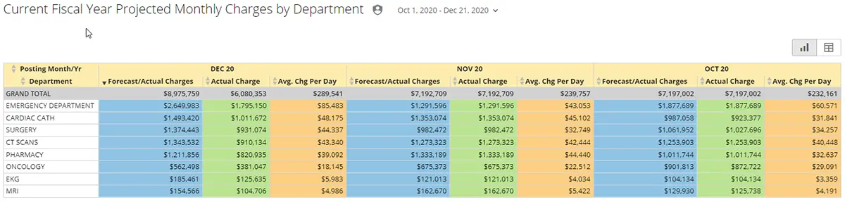
Wouldn’t it be great to have projected revenue, revenue trend, and revenue impact data at your fingertips along with cost-saving opportunities? SMaRT Analytics provides linked interactive charts to help you monitor and identify daily charging issues by department and statistics. These charts include multiple month-end projection methodologies.
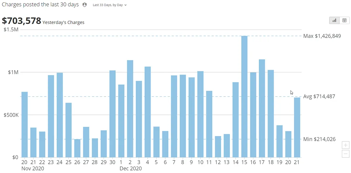
Daily Revenue

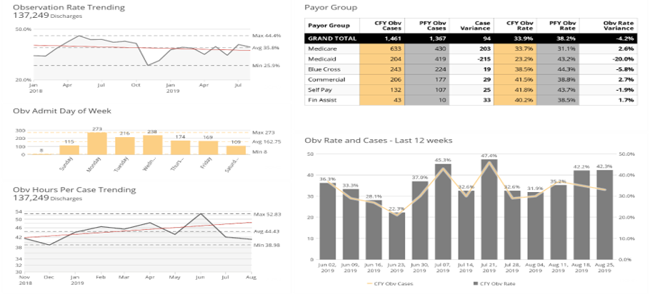
Revenue Trends
The Revenue Trends Dashboard links interactive charts to observe daily revenue trends by charge code, payor, financial class, department, physician, and more.

Revenue Impact
Why is your revenue up or down?
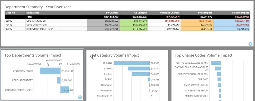
SMaRT Analytics’ linked interactive charts tell you why revenue is up or down over a comparative period, breaking down the variance between price and volume.
Executive Summaries
Leaders receive actionable information via email each month-end without signing into another application or requesting a custom report.
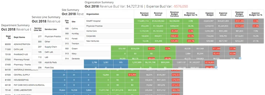
The SMaRT Analytics Platform automatically aggregates revenue and expense variance summaries based on responsibility and by region, market, entity, service line, and department.
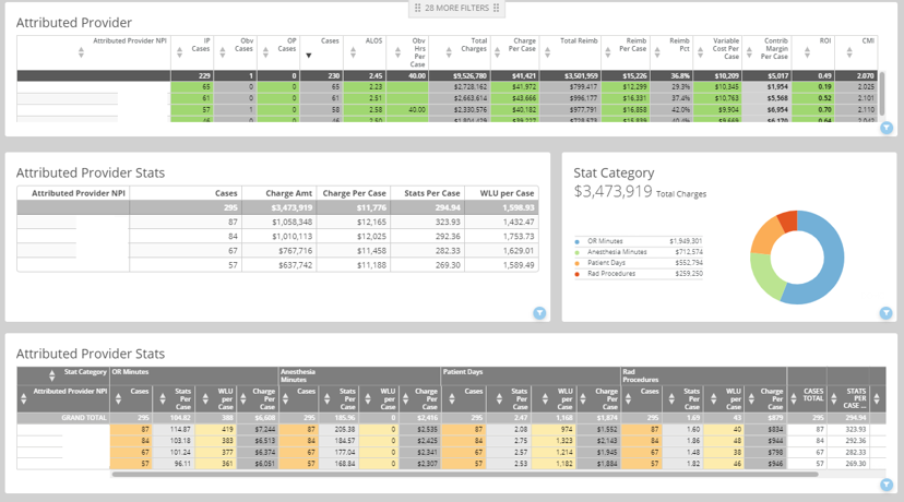
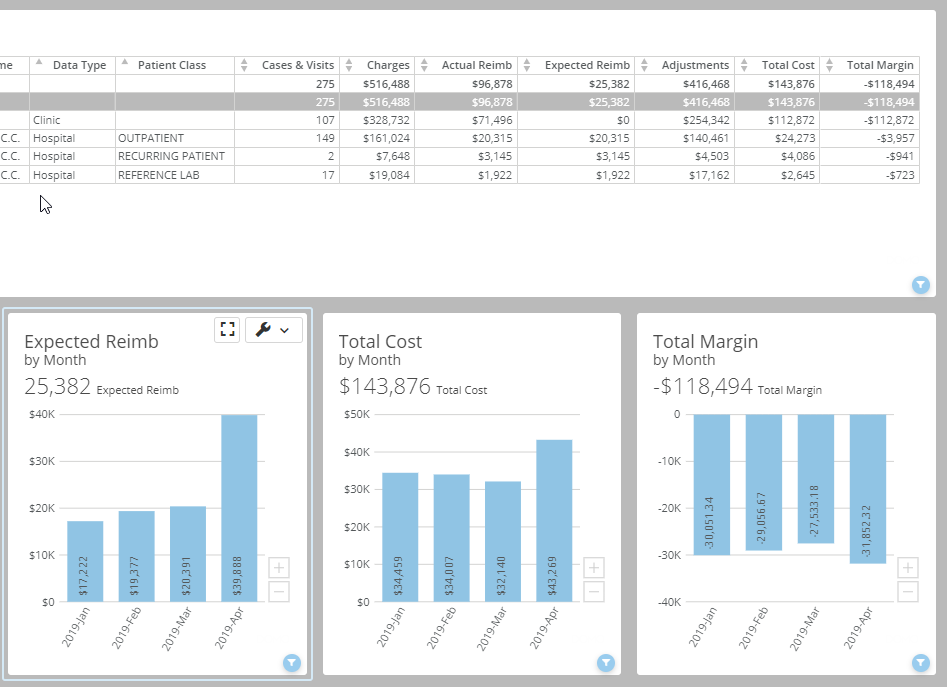
Department Analytics
These linked interactive charts are an upgrade to traditional month-end department operating reports.
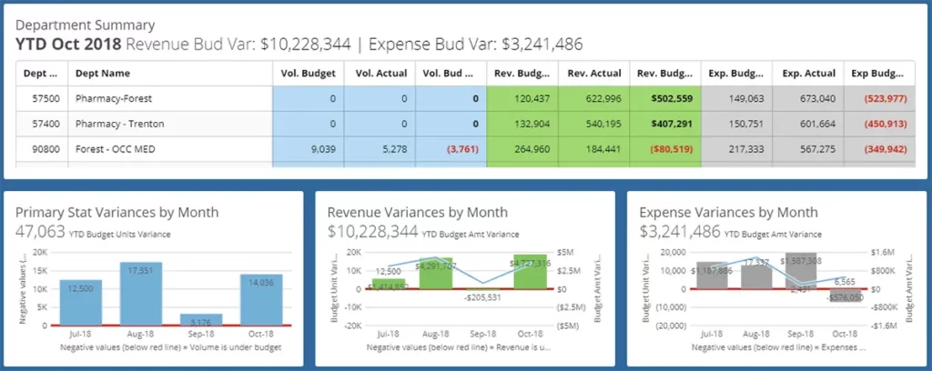
They look at financial performance by individual department or any aggregation of departments, including common groups such as region, market, entity, service line, and location. And they are automatically delivered via email!
Month-end P&L Variance Analysis
Comparing actual performance to either a fixed or variable budget doesn’t have to be a numeric eye exam. SMaRT Analytics provides numerous easy-to-interpret, color-coded charts to show you where any department, or aggregation of departments, is performing as expected, and where they need more attention.